Abeka Academy
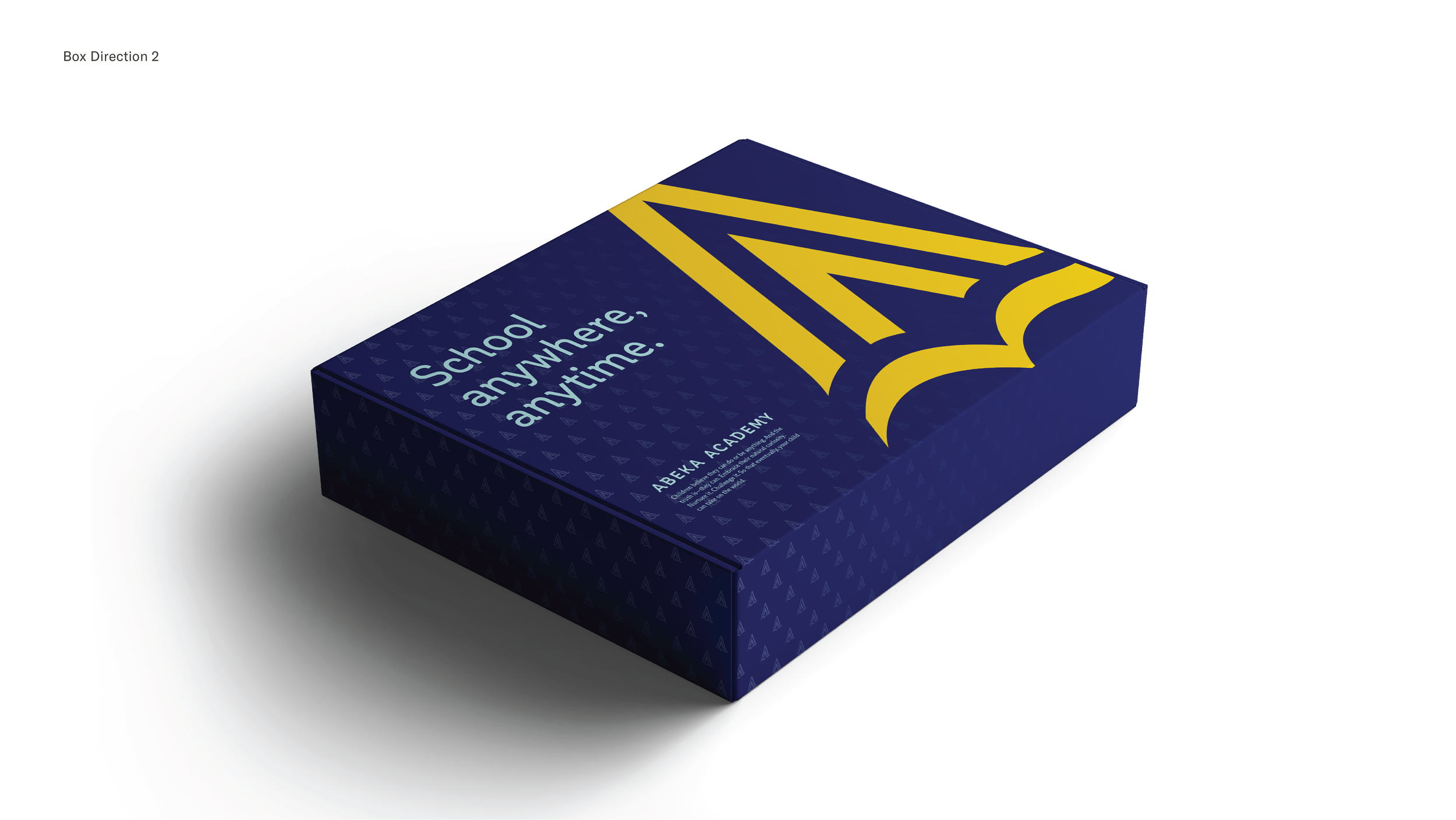
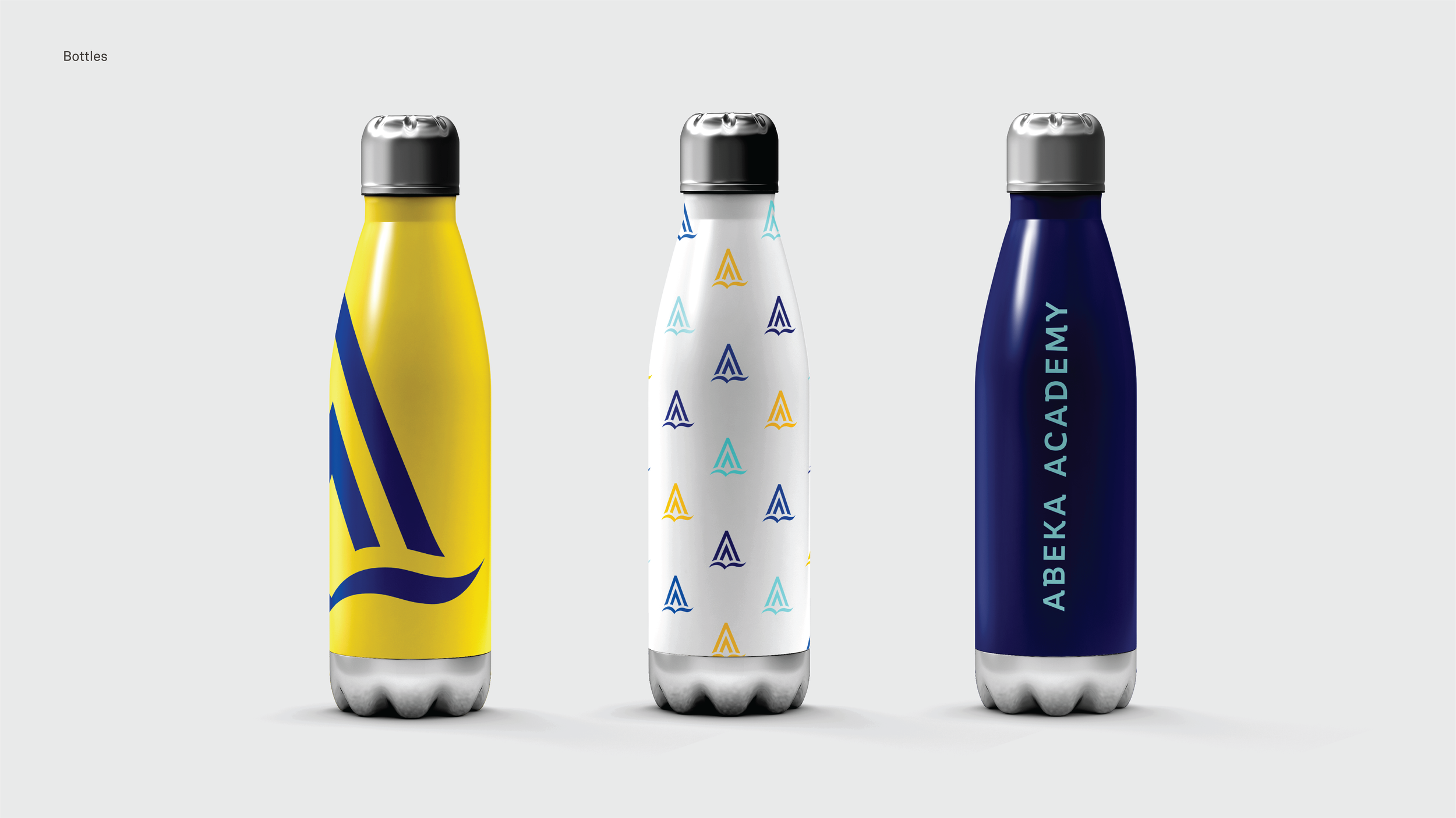
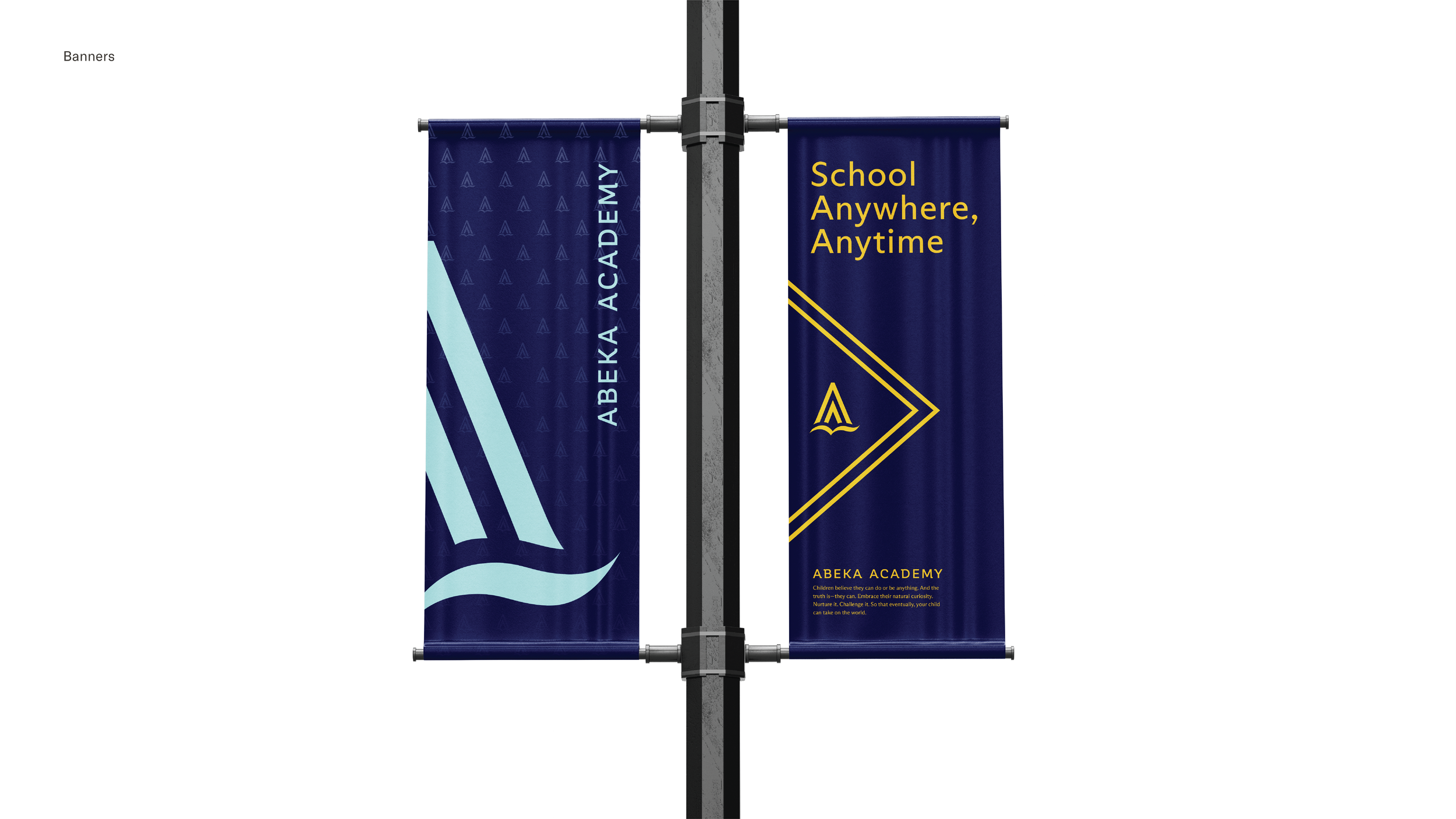
This rebrand direction carries over the Abeka book as the anchor Abeka Academy’s new mark. I have created an abstracted A, which doubles as an arrow and a flame. The arrow symbolizes academic progress, while the flame represents knowledge. These elements, supported by the familiar book, ensure that Abeka Academy stays grounded to its parent brand’s core values.
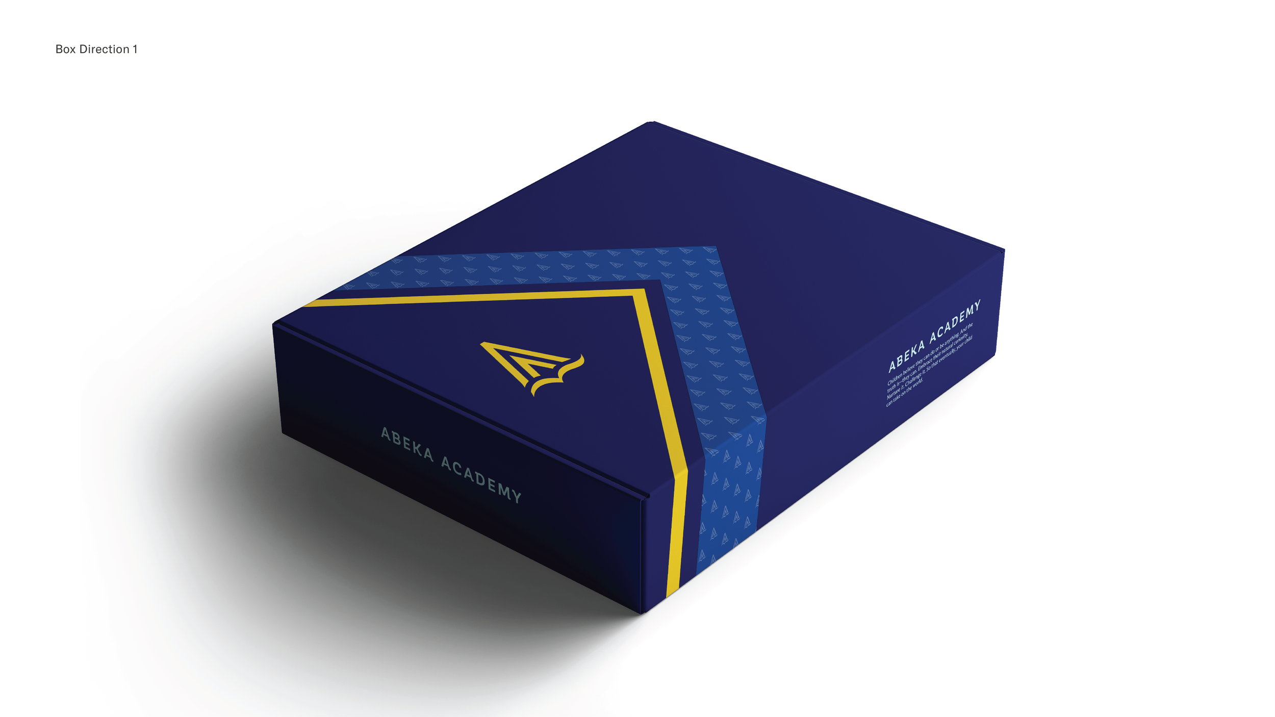
Branding/Identity Packaging